County Sports Team’s Logos: Ranked
Some are good, some are bad, some aren’t even theirs. In this list I delve into the best (and worst) logos our County high schools have to offer
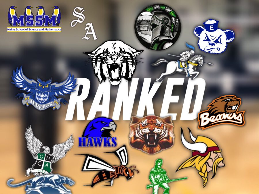
Big County, small schools, huge traditions. Sportswriter Cameron Levasseur offers up a ranking of the sports logos of our local schools.
January 14, 2020
1.
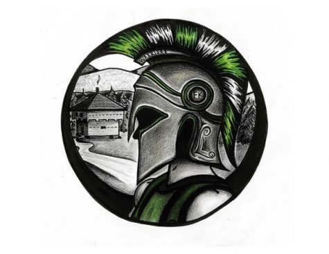
Fort Kent: Perhaps the most unique logo on this list, the current emblem of the Fort Kent Warriors came to be in 2015 as the school sought to move away from the Native American themed logo of old. Designed by former student Erin Chasse and voted upon by the student body, it features a spartan dubbed in the school colors of green and white with a circular design centered around the abbreviation FK stretching across the upper half of the helmet. In the background we see the blockhouse, which was built in the midst of the Aroostook War, set in a forest scene so common to our area. That direct nod to the town in the design adds a cool aspect to it and takes it to the top of this list.

2.
Madawaska: Sharing both colors and mascot with our very own UMPI Owls, the Owls of Madawaska High School have debatably one of the best logos in our corner of the state. The noticeably crisp looking emblem shows a fierce looking owl carrying a banner depicting its species’ name with it wings spread as if it’s ready to attack. The use of color in it, to me, is seemingly perfect; no color is under or overused and it gives off a sense of professionalism.
Presque Isle: The classic Wildcat logo of our high school has been a County icon for generations. Reminiscent of most other logos by the same name, it’s similar but unique at the same time. It captures the essence and storied history of Presque Isle sports in a single image.
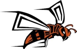
Ashland: The Hornets of Ashland are the only school in The County to sport an insect as a mascot, and they do so well. The sleek design of the orange and black vespids features an angry competitive demeanor hoped to be replicated by the school’s athletes in competition.

5.
Hodgdon: I’m a big fan of Hodgdon’s logo. It’s clean, professional looking and gets the message across adequately. The only thing I’m not entirely sold on is the font/look of the word Hawks at the bottom. It could be tweaked to boost the overall appeal of the emblem.

6.
Southern Aroostook: If a part of the logo for the Southern Aroostook Warriors looks familiar to you, you’re probably a baseball fan, because the capital A symbolizing Aroostook is the same A used in the center of the Oakland A’s logo. I doubt this was intentional however, as the S preceding it comes from the same exact font, leading me to believe it was just a strange coincidence. There’s something to be liked about the simplicity of this logo. It seems to me like it perfectly fits the location.

7.
Van Buren: In line with every other crusader logo ever, Van Buren’s logo features a knight on horseback charging into battle, bearing the school’s colors upon the saddle. While not unique, the design is executed well which boosts my overall opinion of it.
8.
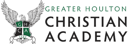
GHCA: The logo used to represent the Eagles of Greater Houlton Christian Academy has that private school flavor to it. The crest with the year of inception surrounded by an eagle with its wings spread just screams prep to me, which, as they are a private school going by the title “Academy” it makes sense. It’s just unlike any other in The County.

9.
Central Aroostook: The crest for the Panthers of Central Aroostook shows a side profile of panther climbing over rocks/and or mountains with a look of anger upon its face. I’d like to assume that it’s supposed to represent Mars Hill mountain because that adds to the meaning behind the logo and the area it comes from, but I don’t know if that was the intended purpose.
10.
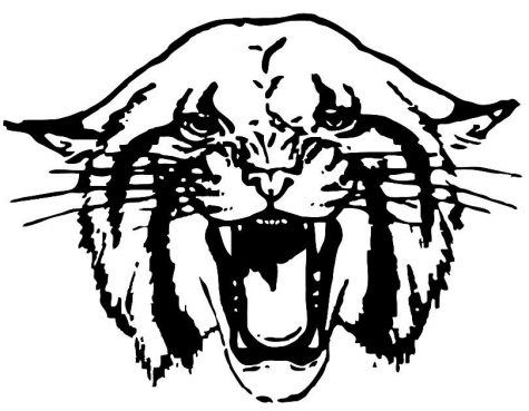
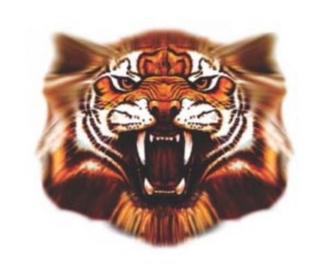
Fort Fairfield:
Setting the tone for the school’s play on the field and court, the logo of the Fort Fairfield Tigers features an aggressive roaring tiger that is seemingly unique to the school. Not sure I’m a fan of the increasing blurriness as you move to the outer parts, but it gets the message across.
11.
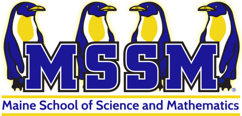
MSSM: Not known for their athletic prowess, the mascot of the Maine School of Science and Mathematics is about what you’d expect from the school. Standing in the background of the school’s name are four penguins with possibly the most content look possible on their faces. Is it fitting of the school? Yes. Is it in intimidating in the slightest? No. It’s the only mascot themed logo in the area lacking a certain air of fierceness.

12.
Wisdom: Looking like an aggressive David Bowie holding a rifle, the logo of the Wisdom Pioneers is just that, a pioneer. While it does get the point across, the two- color, old fashioned logo does leave a lot to be desired.
13.
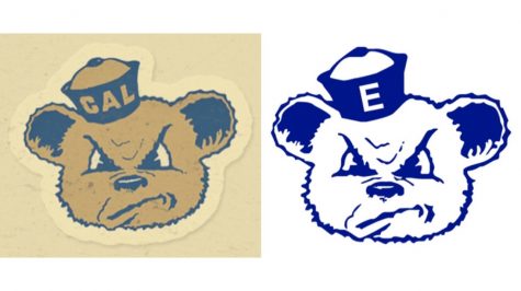
Easton: The logo of the Easton Bears is no doubt unique to anything else the county has to offer. Featuring an angry bear with what appears to be a sailor cap atop it’s head, the old school logo is exactly that, Old School. It’s a 1950’s era logo used by the University of California Berkeley, which, much like over a hundred other college mascot logos at the time, was penned by former Disney employee Arthur Evans. Instead of Cal navy and gold, this Northern Maine icon sports blue throughout, featuring the letter E for its town of residence upon its cap. It sinks to the bottom of these rankings because the design itself is not originally theirs.

14.
Caribou:
In a very un-original move, the logo of the Caribou Vikings was ripped straight from the Minnesota Vikings of the NFL. The only change made to the logo is the colored band at the base of the Viking’s helmet from purple to a maroon.

15.
Washburn: Another recycled college logo, the emblem used by the Washburn Beavers is actually a secondary logo for the OSU (Oregon State University) Beavers of the NCAA Pac-12 conference. No alterations have been made to the design, even though the orange and black of the logo does not match the blue and yellow commonly worn by the Class D school.
Unranked:
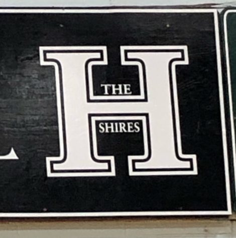
Houlton: It’s just an H.